
Material design
is a comprehensive approach to visual, interaction and motion design
for the multi-screen world. Android 5.0 Lollipop and the updated
support libraries help you to create material UIs. Here’s a rundown of
some of the major elements of material design and the APIs and widgets
that you can use to implement them in your app.
Tangible surfaces
In material design, UIs are composed of pieces of digital paper & ink.
The surfaces and the shadows they cast provide visual cues to the
structure of the application, what you can touch and how it will move.
This digital material can move, expand and reform to create flexible
UIs.
The surfaces and the shadows they cast provide visual cues to the
structure of the application, what you can touch and how it will move.
This digital material can move, expand and reform to create flexible
UIs.
Shadows
A surface’s position and depth result in subtle changes in lighting
and shadows. The new elevation property lets you specify a view’s
position on the Z-axis and the framework then casts a real-time dynamic
shadow on items behind it. You can set the elevation declaratively in
your layouts, defined in dips:
and shadows. The new elevation property lets you specify a view’s
position on the Z-axis and the framework then casts a real-time dynamic
shadow on items behind it. You can set the elevation declaratively in
your layouts, defined in dips:
<ImageView …
    android:elevation="8dp" />
You can also set this from code using
The shadow a view casts is defined by its outline, which by default is
derived from its background. For example if you set a circular shape
drawable as the background for a floating action button, then it would cast an appropriate shadow. If you need finer control of a view’s shadow, you can set a
getElevation()/setElevation() (with shims in ViewCompat).The shadow a view casts is defined by its outline, which by default is
derived from its background. For example if you set a circular shape
drawable as the background for a floating action button, then it would cast an appropriate shadow. If you need finer control of a view’s shadow, you can set a
ViewOutlineProvider which can customise the Outline in getOutline().Cards
Cards are a common pattern for creating surfaces holding a distinct piece of information. The new CardView
support library allows you to create them easily, providing outlines
and shadows for you (with equivalent behaviour on prior platforms).
support library allows you to create them easily, providing outlines
and shadows for you (with equivalent behaviour on prior platforms).
<android.support.v7.widget.CardView
    android:layout_width="match_parent"
    android:layout_height="wrap_content">
    <!-- Your card content -->
</android.support.v7.widget.CardView>
CardView extends FrameLayout and provides default elevation and corner radius for you so that cards have a
consistent appearance across the platform. You can customise these via
the
cardElevation and cardCornerRadius attributes, if required. Note that Cards are not the only way of achieving dimensionality and you should be wary of over-cardifying your UI!Print-like Design
Material utilises classic principles from print design to create
clean, simple layouts that put your content front and center. Bold
deliberate color choices, intentional whitespace, tasteful typography
and a strong baseline grid create hierarchy, meaning and focus.
clean, simple layouts that put your content front and center. Bold
deliberate color choices, intentional whitespace, tasteful typography
and a strong baseline grid create hierarchy, meaning and focus.
Typography
Android 5.0 updates the system font Roboto to beautifully and clearly
display text no matter the display size. A new medium weight has been
added (
display text no matter the display size. A new medium weight has been
added (
android:fontFamily=”sans-serif-medium”) and new TextAppearance styles implement the recommended typographic scale for balancing content density and reading comfort. For instance you can easily use the ‘Title’ style by setting android:textAppearance=”@android:style/TextAppearance.Material.Title”. These styles are available on older platforms through the AppCompat support library, e.g. “@style/TextAppearance.AppCompat.Title”.Color

Your application’s color palette
brings branding and personality to your app so we’ve made it simple to
colorize UI controls by using the following theme attributes:
brings branding and personality to your app so we’ve made it simple to
colorize UI controls by using the following theme attributes:
colorPrimary. The primary branding color for the app; used as the action bar background, recents task title and in edge effects.colorAccent. Vibrant complement to the primary branding color. Applied to framework controls such as EditText and Switch.colorPrimaryDark. Darker variant of the primary branding color; applied to the status bar.
Further attributes give fine grained control over colorizing controls, see:
colorControlNormal, colorControlActivated, colorControlHighlight, colorButtonNormal, colorSwitchThumbNormal, colorEdgeEffect, statusBarColor and navigationBarColor.AppCompat provides a large subset of the functionality above, allowing you to colorize controls on pre-Lollipop platforms.
Dynamic color

Material Design encourages dynamic use of color, especially when you
have rich images to work with. The new Palette support library lets you
extract a small set of colors from an image to style your UI controls
to match; creating an immersive experience. The extracted palette will
include vibrant and muted tones as well as foreground text colors for
optimal legibility. For example:
Palette.generateAsync(bitmap,
        new Palette.PaletteAsyncListener() {
    @Override
    public void onGenerated(Palette palette) {
         Palette.Swatch vibrant =
                 palette.getVibrantSwatch();
          if (swatch != null) {
              // If we have a vibrant color
              // update the title TextView
              titleView.setBackgroundColor(
                  vibrant.getRgb());
              titleView.setTextColor(
                  vibrant.getTitleTextColor());
          }
    }
});
Authentic Motion
Tangible surfaces don’t just appear out of nowhere like a jump-cut in
a movie; they move into place helping to focus attention, establish
spatial relationships and maintain continuity. Materials respond to
touch to confirm your interaction and all changes radiate outward from
your touch point. All motion is meaningful and intimate, aiding the
user’s comprehension.
a movie; they move into place helping to focus attention, establish
spatial relationships and maintain continuity. Materials respond to
touch to confirm your interaction and all changes radiate outward from
your touch point. All motion is meaningful and intimate, aiding the
user’s comprehension.
Activity + Fragment Transitions
By declaring ‘shared elements’ that are common across two screens you can create a smooth transition between the two states.
album_grid.xml
…
    <ImageView
        …
        android:transitionName="@string/transition_album_cover" />
album_details.xml
…
    <ImageView
        …
        android:transitionName="@string/transition_album_cover" />
AlbumActivity.java
Intent intent = new Intent();
String transitionName = getString(R.string.transition_album_cover);
…
ActivityOptionsCompat options =
ActivityOptionsCompat.makeSceneTransitionAnimation(activity,
    albumCoverImageView,   // The view which starts the transition
    transitionName    // The transitionName of the view we’re transitioning to
    );
ActivityCompat.startActivity(activity, intent, options.toBundle());
Here we define the same
When starting the new Activity and this transition is animated
automatically. In addition to shared elements, you can now also
choreograph entering and exiting elements.
transitionName in two screens. When starting the new Activity and this transition is animated
automatically. In addition to shared elements, you can now also
choreograph entering and exiting elements.
Ripples

Materials respond to users’ touch with an ink ripple surface reaction. Interactive controls such as Buttons exhibit this behaviour by default when you use or inherit from
Theme.Material (as will ?android:selectableItemBackground). You can add this feedback to your own drawables by simply wrapping them in a ripple element:<ripple xmlns:android="http://schemas.android.com/apk/res/android" android:color="@color/accent_dark"> <item> <shape android:shape="oval"> <solid android:color="?android:colorAccent" /> </shape> </item> </ripple>
Custom views should propagate touch location down to their drawables in the
View#drawableHotspotChanged callback so that the ripple can start from the touch point.StateListAnimator
Materials also respond to touch by raising up
to meet your finger, like a magnetic attraction. You can achieve this
effect by animating the translationZ attribute which is analogous to
elevation but intended for transient use; such that
to meet your finger, like a magnetic attraction. You can achieve this
effect by animating the translationZ attribute which is analogous to
elevation but intended for transient use; such that
Z = elevation + translationZ. The new stateListAnimator attribute allows you to easily animate the translationZ on touch (Buttons do this by default):layout/your_layout.xml <ImageButton … android:stateListAnimator="@anim/raise" /> anim/raise.xml <selector xmlns:android="http://schemas.android.com/apk/res/android"> <item android:state_enabled="true" android:state_pressed="true"> <objectAnimator android:duration="@android:integer/config_shortAnimTime" android:propertyName="translationZ" android:valueTo="@dimen/touch_raise" android:valueType="floatType" /> </item> <item> <objectAnimator android:duration="@android:integer/config_shortAnimTime" android:propertyName="translationZ" android:valueTo="0dp" android:valueType="floatType" /> </item> </selector>
Reveal
A hallmark material transition for showing new content is to reveal
it with an expanding circular mask. This helps to reinforce the user’s
touchpoint as the start of all transitions, with its effects radiating outward radially. You can implement this using the following Animator:
it with an expanding circular mask. This helps to reinforce the user’s
touchpoint as the start of all transitions, with its effects radiating outward radially. You can implement this using the following Animator:
Animator reveal = ViewAnimationUtils.createCircularReveal(
                    viewToReveal, // The new View to reveal
                    centerX,      // x co-ordinate to start the mask from
                    centerY,      // y co-ordinate to start the mask from
                    startRadius,  // radius of the starting mask
                    endRadius);   // radius of the final mask
reveal.start();
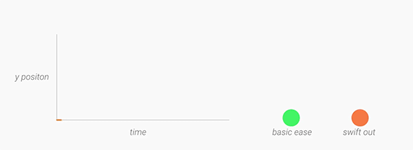
Interpolators
Motion should be deliberate, swift and precise. Unlike typical
ease-in-ease-out transitions, in Material Design, objects tend to start
quickly and ease into their final position. Over the course of the
animation, the object spends more time near its final destination. As a
result, the user isn’t left waiting for the animation to finish, and the
negative effects of motion are minimized. A new fast-in-slow-out interpolator has been added to achieve this motion.
For elements entering and exiting the screen (which should do so at peak velocity), check out the linear-out-slow-in and fast-out-linear-in interpolators respectively.
Adaptive design
Our final core concept of material is creating a single adaptive
design that works across devices of all sizes and shapes, from watches
to giant TVs. Adaptive design techniques help us realize the vision
that each device reflects a different view of the same underlying
system. Each view is tailored to the size and interaction appropriate
for that device. Colors, iconography, hierarchy, and spatial
relationships remain constant. The material design system provides
flexible components and patterns to help you build a design that scales.
Toolbar
The toolbar is a generalization of the action bar pattern, providing
similar functionality, but much more flexibility. Unlike the standard
action bar, toolbar is a view in your hierarchy just like any other, so
you can place instances wherever you like, interleave them with the rest
of your views, animate, react to scroll events and so on. You can make
the Toolbar act as your Activity’s Action Bar by calling
Activity.setActionBar().

In this example, the blue toolbar is an extended height, overlaid by
the screen content and provides the navigation button. Note that two
further toolbars are used in the list and detail views.
the screen content and provides the navigation button. Note that two
further toolbars are used in the list and detail views.
For details of implementing toolbars, see this post.
Go Forth and Materialize
Material Design helps you to build understandable, beautiful and
adaptive apps, which are alive with motion. Hopefully, this post has
inspired you to apply these principles to your app and signposted some
of the new (and compatibility) APIs to achieve this.
adaptive apps, which are alive with motion. Hopefully, this post has
inspired you to apply these principles to your app and signposted some
of the new (and compatibility) APIs to achieve this.


0 comments:
Post a Comment
Thank you very much for your comments ....................... Please stay with this blog